How to Make a Photo Black and White Online — Free Instant Tool
Convert any photo to black and white in seconds with a free browser tool. No software needed. Learn the 3 methods and when each works best.
Converting a color photograph to black and white is one of the most powerful creative transformations available in photography. A well-executed monochrome conversion strips away the distraction of color and reveals the underlying structure of an image — its shapes, textures, contrast patterns, and light quality. What many people do not realize is that there is not just one way to remove color from an image. There are three fundamentally different conversion methods, each producing distinctly different results from the same source photograph. This guide explains all three methods, shows you how to use Akhbarq's free browser-based converter, and provides practical advice for making black and white images that look professional rather than simply desaturated.
Why Convert Photos to Black and White — The Real Reasons
Black and white photography is not simply an aesthetic preference — it serves specific creative and practical purposes that color cannot achieve.
Emphasis on composition and form. Color photographs direct the viewer's attention to colors first, often at the expense of compositional elements. A bright red object in a landscape dominates attention regardless of its compositional importance. In black and white, the viewer's eye follows light, shadow, lines, and shapes instead — the fundamental elements of strong visual composition. Converting to monochrome reveals whether an image has genuine compositional strength or was relying on color to create visual interest.
Texture and detail visibility. Black and white images emphasize texture in ways that color images suppress. The grain of weathered wood, the surface of rough stone, the pattern of fabric weave, the delicate structure of a flower petal — all become more prominent and tactile when color is removed. For product photography of textured materials, architectural photography emphasizing material surfaces, and portrait photography focused on character and expression, black and white delivers superior textural communication.
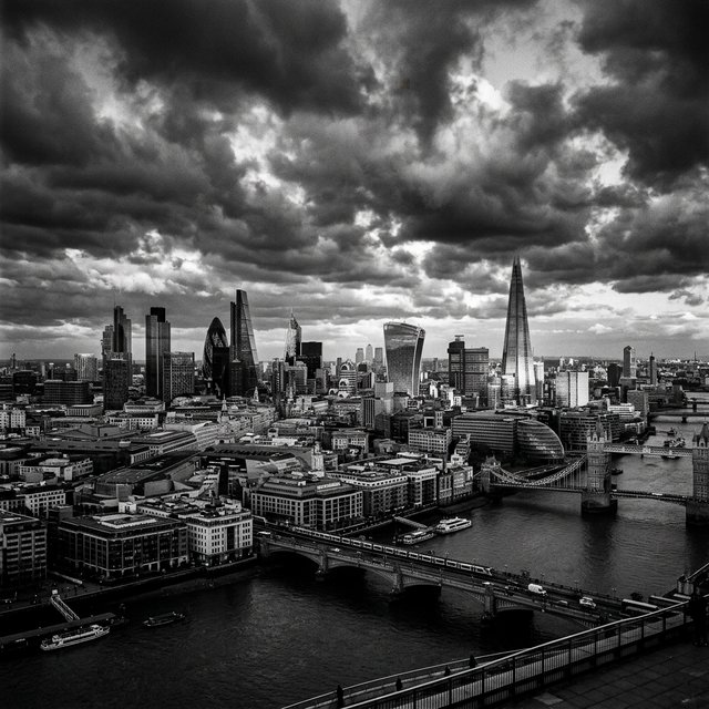
Emotional tone and timelessness. Monochrome images carry an inherent sense of timelessness and emotional gravity. A color photograph of a city street immediately reveals its era through car colors, sign designs, and fashion trends. The same scene in black and white transcends its specific time period, becoming more universal and emotionally resonant. Documentary photographers, photojournalists, and fine art photographers use monochrome specifically for this psychological effect.
Rescue problematic color. Some photographs have technically correct exposure and composition but suffer from unappealing or distracting color casts — yellow artificial lighting, mixed light temperatures, clashing colors in the scene, or skin tones rendered unfavorably by the light source. Converting to black and white eliminates these color problems entirely, often transforming a mediocre color photograph into a compelling monochrome image.
Method 1 — Simple Desaturation (Fast and Universal)
Desaturation is the simplest and most common method of black and white conversion. It works by reducing the color saturation of every pixel to zero, converting each pixel to a shade of gray based on an equal average of its red, green, and blue channel values.
How it works technically. In the RGB color model, every pixel has three values: Red, Green, and Blue, each ranging from 0 to 255. Simple desaturation calculates the average of these three values and sets all three channels to that average. A pixel with RGB values (200, 100, 50) becomes (116, 116, 116) — a medium gray. This produces a neutral grayscale that represents each color with equal weight.
Strengths. Fast, predictable, and universally available in every image editing tool and online converter. Results are consistent and reproducible — the same input always produces the same output. For general-purpose conversion where speed matters more than fine art control, desaturation is perfectly adequate.
Weaknesses. Treats all colors with equal weight, which can produce flat, lifeless results. Two colors that look dramatically different in color (bright red and bright green) may convert to nearly identical shades of gray because their average RGB values are similar. This tonal collision causes visual elements that were clearly distinct in color to merge and become indistinguishable in the black and white conversion.
Method 2 — Channel Mixing for Professional Results
Channel mixing gives you control over how each color converts to gray by allowing you to assign different weights to the red, green, and blue channels. Instead of averaging all three channels equally, you decide how much each color contributes to the final grayscale value.
How it works. A typical channel mix might weight the channels as 40% Red, 40% Green, and 20% Blue. With this configuration, a bright red object (255, 0, 0) converts to a light gray (value 102), a green object (0, 255, 0) also converts to a light gray (value 102), and a blue object (0, 0, 255) converts to a darker gray (value 51). Adjusting these weights changes the relationship between colors in the final black and white image.
Classic presets. Traditional black and white film responded to colors differently than digital desaturation. Red filter simulation uses high red channel weight (80% Red, 10% Green, 10% Blue), darkening blue skies dramatically while keeping warm tones bright — the signature look of Ansel Adams landscapes. Green filter simulation brightens foliage and skin tones. Blue filter lightens skies and darkens warm objects.
Strengths. Provides creative control over tonal relationships between colors. Different channel mixes produce dramatically different interpretations of the same photograph, allowing you to choose the conversion that best serves your creative intent. This is the standard professional approach in Photoshop (Channel Mixer adjustment layer) and Lightroom (B&W Mix panel).
Method 3 — Luminosity-Based Conversion (Most Natural)
Luminosity-based conversion weights the RGB channels according to human visual perception rather than treating them equally. The human eye is most sensitive to green light, moderately sensitive to red, and least sensitive to blue. Luminosity conversion reflects this biological reality by weighting green more heavily than red or blue.
The standard formula. The ITU-R BT.709 luminance formula, used in most professional software, weights the channels as: Luminance = 0.2126×Red + 0.7152×Green + 0.0722×Blue. This means green contributes over 71 percent of the perceived brightness, red contributes about 21 percent, and blue contributes only about 7 percent. This weighting produces grayscale values that match how humans perceive brightness in the real world.
Why it looks more natural. Because the formula mirrors human vision, luminosity-based conversion produces results that feel perceptually accurate. Bright green grass looks appropriately light, blue sky maintains its expected mid-tone value, and warm skin tones render with natural apparent brightness. The resulting image feels like a faithful representation of the scene's brightness rather than a mathematical averaging of color data.
💡 Key Insight
Your image is converted locally in your browser — never uploaded to any server. Akhbarq's black and white converter uses client-side JavaScript to process your image entirely on your device. This means your photographs remain private, processing is instant (no upload/download wait), and the tool works without an internet connection once loaded. This is particularly important for portrait photographers and anyone converting images with identifiable faces or locations.
How to Use Akhbarq BW Converter (Client-Side Processing)
Akhbarq's Black and White Converter processes your photograph entirely in your browser. No upload to external servers, no account required, and no software to install. Here is the process.
Step 1: Open the Akhbarq Black and White Converter in any modern browser. The tool loads a JavaScript-based image processing engine that runs locally on your device.
Step 2: Drag your color photograph onto the upload zone or click to browse. The tool accepts JPEG, PNG, and WebP images at any resolution.
Step 3: Select your conversion method (Desaturation, Channel Mix, or Luminosity). Preview the result in real-time. Adjust settings if the selected method offers customization options.
Step 4: Download the converted image. The output maintains the original image's resolution and format. Processing typically completes in 1-3 seconds for standard photographs.
What Makes a Good Black and White Photo?
Not every photograph works well in black and white. Understanding which images benefit from monochrome conversion helps you make better creative decisions.
Strong contrast works best. Images with a wide range of tones — from deep blacks to bright whites with rich mid-tones — produce the most compelling black and white results. Flat, low-contrast images tend to look gray and lifeless without color to provide visual interest. If your color photograph relies primarily on color contrast (complementary colors creating visual separation) rather than luminance contrast, its black and white conversion may appear flat.
Interesting textures and patterns. Monochrome emphasizes texture more than color images. Photographs featuring weathered surfaces, architectural details, textured fabrics, tree bark, stone walls, or wave patterns benefit substantially from black and white conversion. The absence of color focuses attention entirely on surface quality and pattern.
Portraits with character. Black and white portraits emphasize facial structure, expression, and the quality of light on skin. The format strips away distracting background colors, clothing colors, and skin tone variations, focusing the viewer entirely on the subject's face. This is why editorial portrait photography frequently uses monochrome — the format creates immediate intimacy and psychological depth.
When to keep color. Images that depend on color for their story — sunsets, autumn foliage, colorful markets, product photography where color accuracy matters — lose their essential character in black and white. If the most interesting element of your photograph is its color, monochrome conversion removes the very thing that makes the image compelling.
After Conversion — Brightness and Contrast Tips
A raw black and white conversion is rarely the final image. Post-conversion adjustments to brightness and contrast complete the transformation and elevate the image from merely desaturated to genuinely compelling.
Increase contrast for dramatic impact. Most black and white conversions look better with slightly increased contrast — darker blacks, brighter whites, and a wider tonal range. A 10-20 percent contrast increase after conversion typically adds the visual punch that distinguishes a professional black and white image from a casual desaturation. Avoid excessive contrast, which clips shadow detail and highlight detail, creating a harsh, unrefined appearance.
Adjust brightness for mood. A brighter overall image feels airy, ethereal, and hopeful. A darker overall image feels moody, dramatic, and serious. Adjust the brightness to match the emotional tone you want the image to communicate. High-key (predominantly light tones) and low-key (predominantly dark tones) are both legitimate artistic choices that serve different purposes.
Dodge and burn for emphasis. Professional photographers selectively lighten (dodge) and darken (burn) specific areas of their black and white images to guide the viewer's eye. Lightening the subject's face in a portrait, darkening distracting background elements, or increasing the brightness of a focal point draws attention exactly where you want it. Most image editors and online tools provide brush-based dodge and burn functionality.
✅ Pro Tip
Increase contrast after your black and white conversion for more dramatic results. A 10-20% contrast boost typically adds the visual depth that separates a professional monochrome image from a simple desaturation. Apply the contrast increase after the black and white conversion, not before — increasing contrast on the color image before conversion produces different (and usually inferior) results. Always work from a copy to preserve your original color photograph.
Printing Black and White Photographs
If your black and white images are destined for printing rather than web display, several additional considerations come into play. Screen display and print output handle grayscale differently, and failing to account for these differences can result in prints that look flat, muddy, or lacking in tonal range compared to their screen appearance.
Color mode matters for print. Web images use RGB color mode, but professional print outputs perform best with grayscale-specific color profiles. When preparing a black and white image for printing, convert it to true grayscale mode (8-bit, single channel) in your image editor. This eliminates any residual color casts that may exist in an RGB file with equal R/G/B values — casts that are invisible on screen but can appear as subtle color tints on paper.
Paper selection dramatically affects the result. Matte papers emphasize texture and produce a softer, more artistic look. Glossy papers maximize tonal range and contrast, making blacks appear deeper and whites brighter. Fine art cotton papers provide the widest tonal range and the most archival longevity, making them the preferred choice for professional black and white prints intended as artwork or gallery display.
Monitor calibration is essential. An uncalibrated monitor may display tones inaccurately, leading to prints that are too dark, too light, or lacking in contrast. Before printing black and white work, calibrate your monitor using a hardware calibration device. This ensures the tones you see on screen closely match the tones that appear on paper, reducing the need for costly test prints and reprints.
Frequently Asked Questions
Q: Can I convert a black and white photo back to color?
A: Not from the converted file — removing color is a one-way process that permanently discards color data. AI colorization tools (like DeOldify) can estimate plausible colors and add them to grayscale images, but they are guessing based on learned patterns, not recovering the original color information. Always keep your original color photograph as a backup before any conversion.
Q: Which method produces the best results?
A: There is no universally "best" method — the right choice depends on the specific image and your creative intent. Luminosity-based conversion produces the most perceptually natural results for most photographs. Channel mixing gives the most creative control. Simple desaturation is fastest and works adequately for casual use. Experiment with all three methods on your specific images to see which interpretation you prefer.
Q: Does black and white conversion reduce file size?
A: Slightly, but not significantly for JPEG files. A black and white JPEG stores three identical channel values per pixel (R=G=B), which the JPEG algorithm does not compress much more efficiently than three different values. For PNG files, true grayscale mode (8-bit single channel instead of 24-bit RGB) reduces file size by approximately two-thirds. Most online converters output RGB images with gray values rather than true grayscale mode.
Q: Why does my black and white conversion look flat?
A: Flat-looking conversions typically result from low-contrast source images or from using simple desaturation on images where multiple colors map to similar gray tones. Solutions include: increasing contrast after conversion, trying channel mixing with different weights to create tonal separation between similar-brightness colors, or choosing a different source image that has stronger luminance contrast.
Q: Can I convert only part of a photo to black and white?
A: Yes — this is called selective desaturation or color splash. The technique converts most of the image to black and white while preserving color in one specific area (a red rose, a yellow taxi, a person's eyes). This requires a tool with layer masking capability — Photoshop, GIMP, or advanced online editors. It is an attention-directing technique that creates strong visual impact when used sparingly and purposefully.

Akhbarq Engineering
Lead Technical Architecture Team
Dedicated to building high-performance web utilities and sharing in-depth knowledge on digital optimization, security, and next-generation web platforms. We simplify complex technologies for millions of users globally.